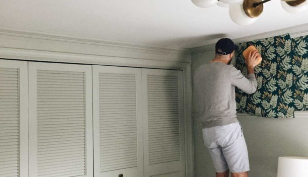


Although an entirely legitimate room, we wanted our baby’s pantry-turned-nursery to feel really intentional and not have a sad or cramped feel. So painting was a must, just to make it feel that much more decorated. First, a side note that the lighting in the pantry is completely irritating. It is extremely yellowing and pink and not in the good, “warm” way. Would a different lightbulb make a significant difference? I am oblivious about the world of light bulbs and which ones do what.
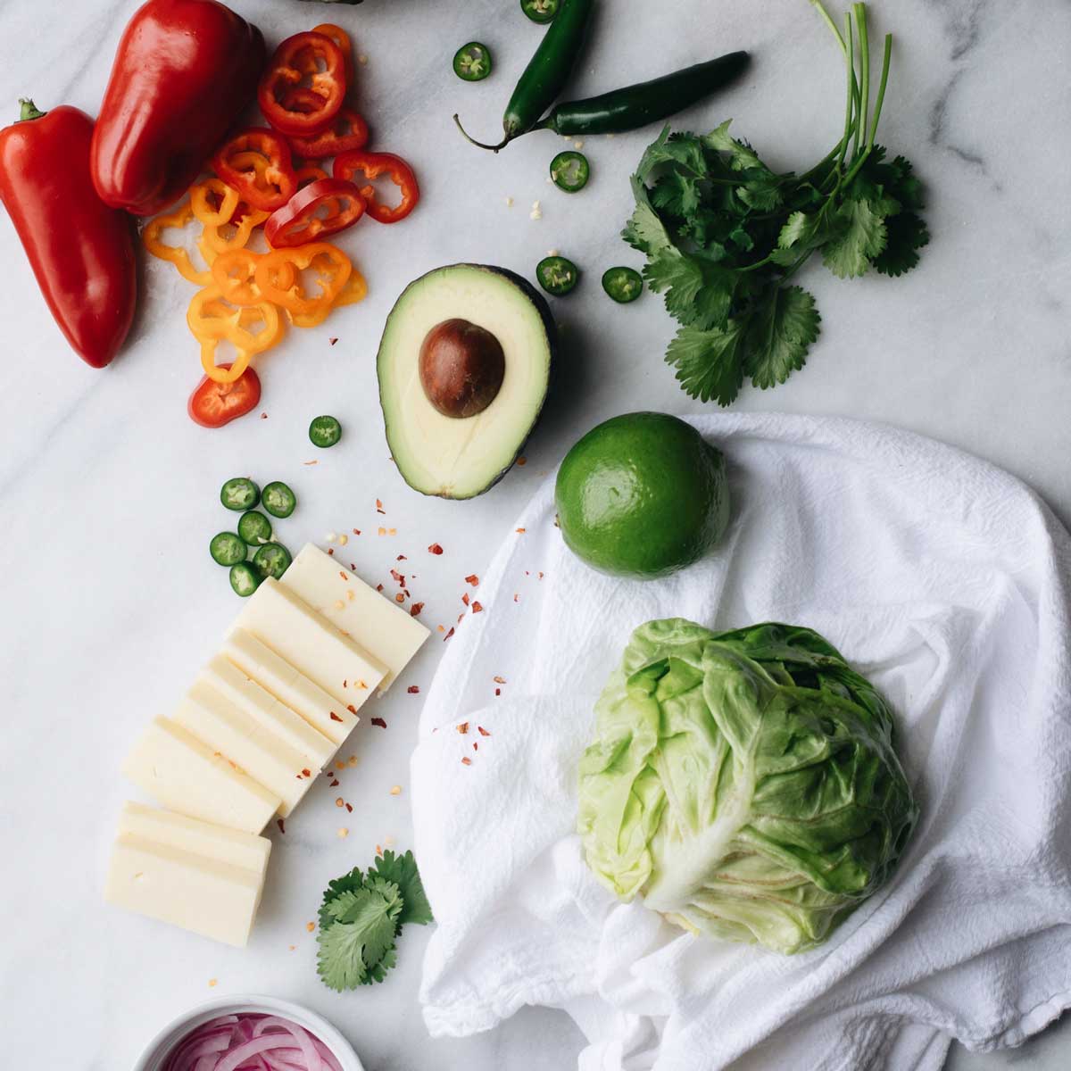
The four colors in the middle of the below photo are my color scheme. I’m calling them mint, red-orange, navy, and mustard. This is my best effort at creating something that works for both boys and girls, although I am becoming more and more convinced that a nursery that truly is equally good for both has never existed. This would skew completely boy, but I think the mint might be keeping it somewhere in the girl ballpark too. (See, I even used a sports metaphor. How boyish.)

After an inordinate amount of decision time considering how long we’ll be living in the apartment, we picked was Martha Stewart’s “Flagstone.” I think that’s the top left in the picture.
I have never seen a paint color with such a great difference between it’s wet and dry tone. This thing went on quite dark and was substantially lighter when we were done.
We are that much closer to baby’s room being prepared!