


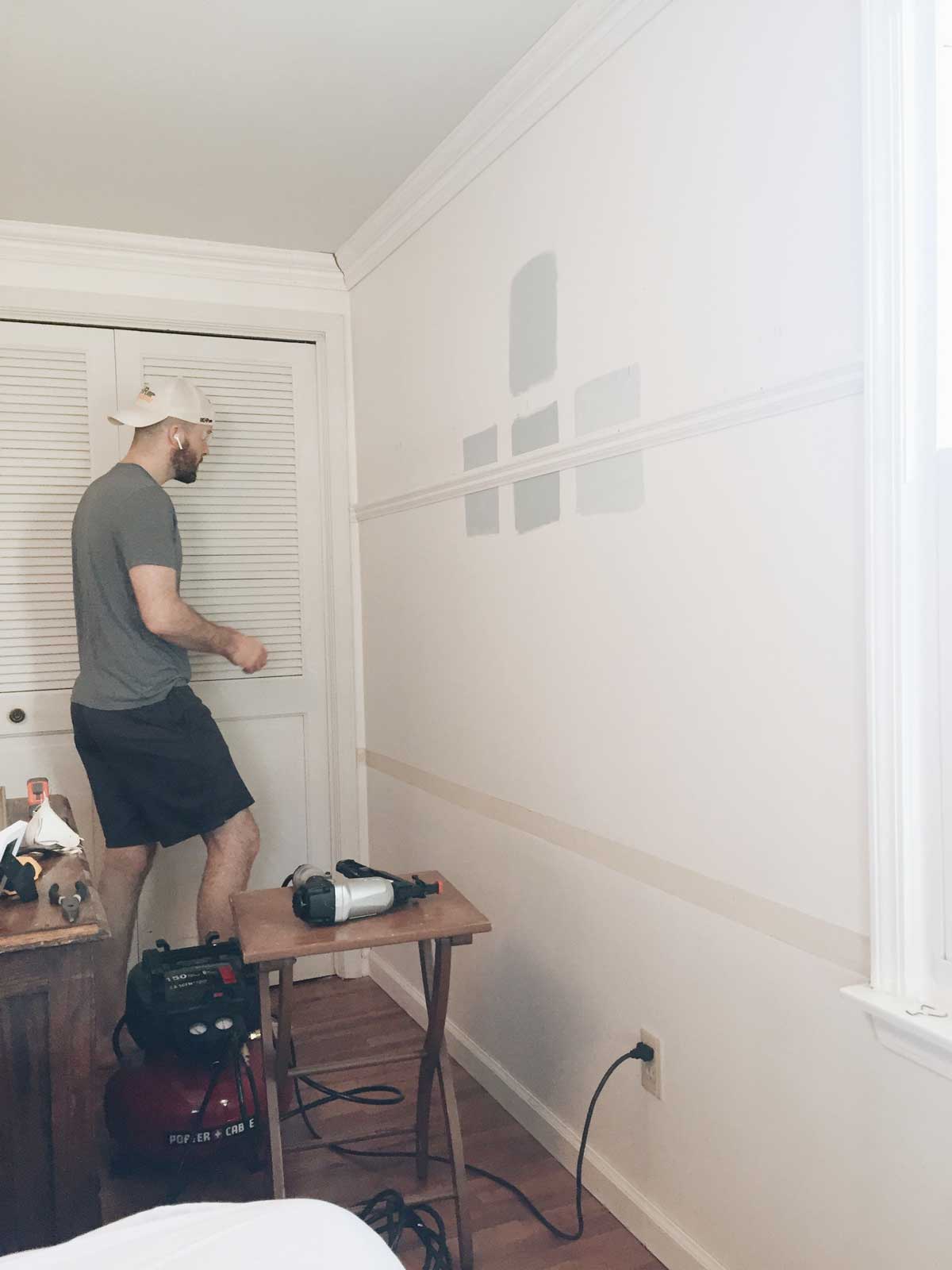
The first step for beginning work on our master bedroom was paint! I wanted a very subtle blue-gray-green. And I wanted to make sure it was subtle. I feel like people often want a subtle color for a room, but picking from paint swatches is hard and you have to go EXTREMELY muted or else once it’s up in full form on all four walls it ends up intense anyway. (I feel like this is many a new mother’s dilemma when they wanted a soft pink for their daughter’s room. What looks relatively pale on the swatch ends up still electric and bright.)
I did all my tricks – only looking in the “neutrals” section of the paint deck, definitely doing test pots, trying the color at 75%, and of course having the paint desk person tweak it even a little more for me at the end (adding some black). I did not want to paint this room twice, so I even rolled the whole test pot out on an entire wall.
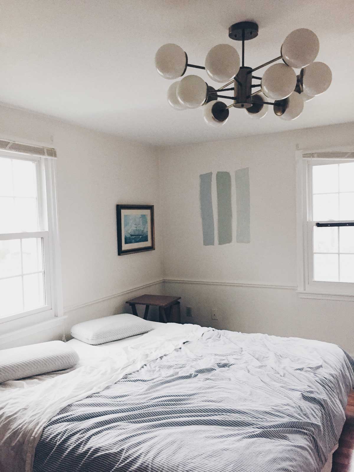
Paint colors are pretty much always a little stressful but I am SO HAPPY with this color! It is EXACTLY what I wanted. And if you’re looking for a blue-gray-green too it is very good. It’s clearly “a color” and adds a lot of personality, but still has a subtleness that makes it almost like a neutral. I love it! Some of these photos are brightened so it looks a bit darker in person.
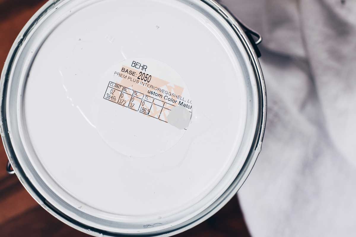
It was a complicated color match. It started as farrow & ball’s “light blue,” but then I tweaked it a touch (because the color match computer cannot be trusted!!).
Above is a picture of the label if you want them to whip some up for you at home depot. I also tried behr’s “krypton” (left) and sherwin williams “sea salt” (right).
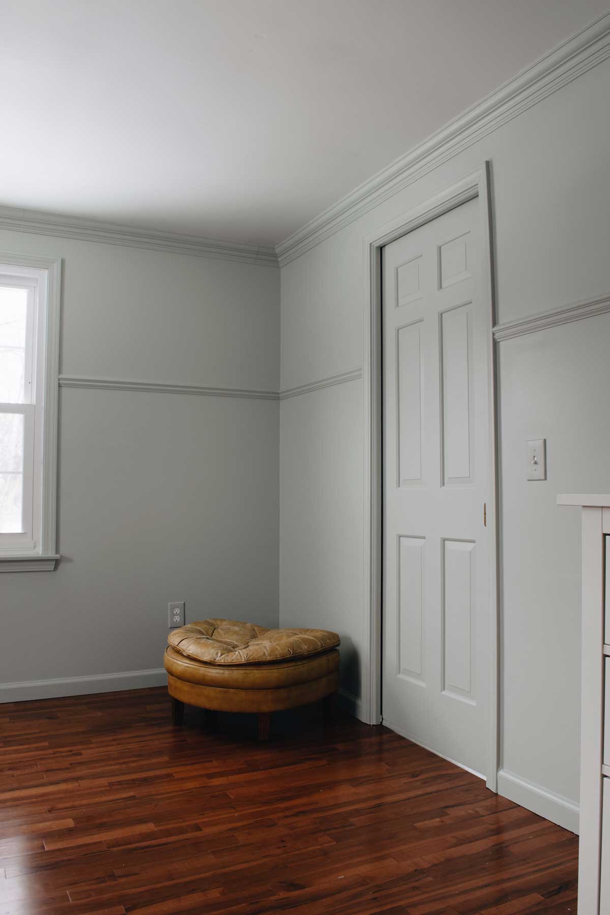
The other thing that has made me really happy with our bedroom is that we painted EVERYTHING. I noticed this as something I was seeing in lots of rooms I was inspired by (just a few examples are here, here, here). All the trim and moulding and doors are painted the wall color.
To me it looks so nice in a room that is a touch of traditional. The uniform color feels really sophisticated and clean. It lets the details come out more too. And sometimes chunky white trim with a bright colored wall can feel early 2000’s to me.
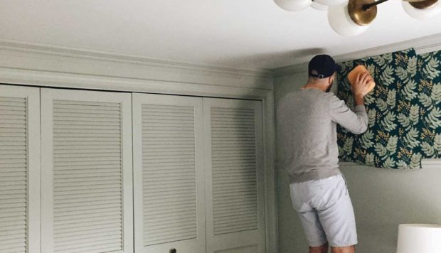
Just one small illustration is the before and after of the closet doors.
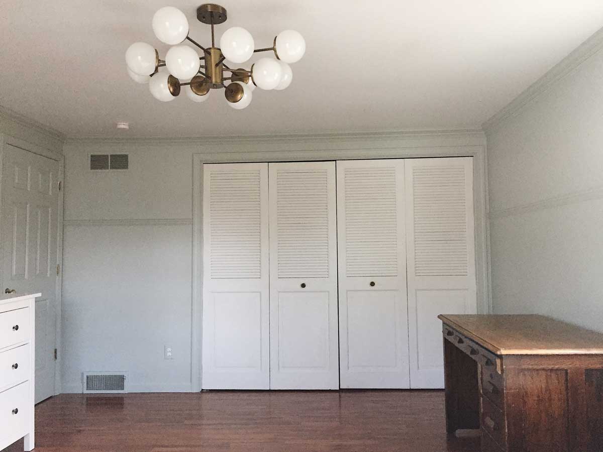
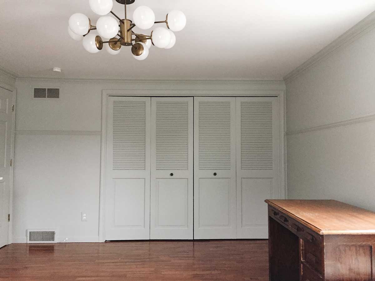
MUCH more polished. It makes the room feel larger without the choppiness of white doors. And since shuttered bi-folds are not my favorite I feel like painting them the wall color minimized them significantly, and I really don’t mind them now.
Oh and outlet covers. I definitely paint the outlet covers the wall color.
The chair rail was in the middle of the wall, and we moved it up to a 3/4 height. I may wallpaper above it. But wallpaper is expensive! So even if I don’t for a while, I think it looks stylish at a 3/4 up level.
We’d been living with our bedroom for so long. I thought of it just as an unoffensive white room that I could deal with. Now that all the walls are repaired, wiped, and caulked I realize how much better it could be all over again.
Paint always feels so good. Next up we are addressing the most important part of the bedroom situation by building a platform bed!